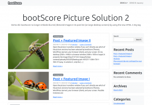
I have already discussed bootScores blurred images. The problem was easy: In cooperation with WordPress, bootScore embeds images of size ‘medium’ in the post lists. And that even on large screens, where the browsers have to fill much more space than the images could do by themselves. Consequently, the browsers upsize the images that are too small — and blur them. Or, put another way: bootScore offers an excellent ‘Responsive Design’ when it comes to the texts. When it comes to the images, not (yet). Here, we offer a way towards bootScore without blurred Featured Images — with the help of HTML‑5:
This time, let me start with the summary before I describe the solutions step by step:
Background
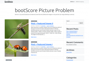
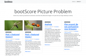
During the past months, I had set up two demos. On an almost pure WordPress 6.11 and a pure bootScore2. Now, I’ve saved the respective screenshots. The left presents the post list with featured images, as the index.php of an unmodified bootScore generates it. The right presents the post list as generated by archive-masonry.php3 from the template package of an otherwise unmodified bootScore.
In both cases, the blurring effect arises on large screens. In the right picture, it is a bit weaker because the difference between the space provided and the size of the embedded image is smaller. Then I offered two solutions, a traditional and an advanced4:
- The traditional solution lets WordPress generate an additional thumbnail when uploading, whose width of 560px is between the default sizes ‘medium’ and ‘large’.5 Additionally, this solution no longer makes the templates ask for the size ‘medium’, but for the self-defined size bsTeaser.
- The advanced solution uses the features of the tag
<img>, as they were enabled under HTML‑5. By that, the pages tell the displaying browsers which images are available and up to what space they should use which one. But eventually, the browser chooses the right one on the base of this information.
The point is this:
- In the traditional solution, we — the site editors — still statically decide which image the browser shall embed into the space — even though we don’t know its actual size (responsive design).
- In the advanced solution, the browser decides, because it knows the size of the actually available, ‘Responsive Design’-conditioned space. And it can decide that because we have told, which images are available with which dimensions.
Solutions
- For solutions 1 and 2 insert the line
add_image_size('bsTeaser', 560, 0, false );into yourfunctions.php: - For solution 1, replace
get_the_post_thumbnail(null, 'medium')withget_the_post_thumbnail(null, 'bsTeaser')in all templates relevant to you. - For solution 2 insert the following lines to your
functions.php:
/*
 * Applay the better html-5 based image tag structure (with srcset and sizes)
 * (C) 2023 Karsten Reincke
 * SPDX-License-Identifier: MIT
 *
 * Created in accordance with
 * a) https://developer.wordpress.org/reference/functions/wp_get_attachment_image_src/
 * b) https://straightvisions.com/en/news/howtos-en/gutenberg-and-responsive-image-sizes/
 */
function html5ThumbnailHtml($html, $post_id, $post_thumbnail_id, $size, $attr) {
  $id = get_post_thumbnail_id($post_id); // gets the id of the current post_thumbnail (in the loop)

  $columnSize=", 400px";
  if (is_single($post_id)) $columnSize=""; // take the complete screen for visualization

  $smSrc="";
  $smSize="";
  $mdSrc="";
  $mdSize="";
  $lgSrc="";
  $lgSize="";
  $flSrc="";
  $flSize="";
  $bsSrc="";
  $bsSize="";
  $defImg=null;

  $smImage=(array) wp_get_attachment_image_src($id, 'thumbnail');
  if ($smImage!=null) {
    $smSrc=$smImage[0] .' '. $smImage[1] .'w';
    $smSize='(max-width: ' . $smImage[1] . 'px) ' . $smImage[1] .'px';
  }

  $mdImage=(array) wp_get_attachment_image_src($id, 'medium');
  if ($mdImage!=null) {
    $mdSrc=$mdImage[0] . ' ' . $mdImage[1] .'w';
    $mdSize='(max-width: ' . $mdImage[1] . 'px) ' . $mdImage[1] .'px';
  }

  $bsImage=(array) wp_get_attachment_image_src($id, 'bsTeaser');
  if ($bsImage!=null) {
    $bsSrc=$bsImage[0] . ' ' . $bsImage[1] .'w';
    $bsSize='(max-width: ' . $bsImage[1] . 'px) ' . $bsImage[1] .'px';
  }

  $lgImage=(array) wp_get_attachment_image_src($id, 'large');
  if ($lgImage!=null) {
    /*
     * There seems to be a bug in wp_get_attachment_image_src($id, 'large'):
     * the function returns a wrong width (640): Solution: hardcode
     * values in accordance with the definition under settings
     */
    $lgSrc=$lgImage[0] . ' ' . '1024w';
    $lgSize='(max-width: ' . '1024px) '  .'1024px';
    $defImg=$lgImage[0];
    //$lgSrc=$lgImage[0] . ' ' . $lgImage[1] .'w';
    //$lgSize='(max-width: ' . $lgImage[1] . 'px) ' . $lgImage[1] .'px';
  }

  $flImage=(array) wp_get_attachment_image_src($id, 'full');
  if ($flImage!=null) {
    $flSrc=$flImage[0] . ' ' . $flImage[1] .'w';
    $flSize='(max-width: ' . $flImage[1] . 'px) ' . $flImage[1] .'px';
    if(!($defImg)) $defImg=$flImage[0];
  }

  $srcSet="";
  $sizeSet="";
  if ($smSrc) {
    $sep=' ';
    if ( ( ($mdSrc)||($bsSrc) )||( ($lgSrc)||($flSrc) ) ) $sep = ', ';
    $srcSet=$smSrc . $sep;
    $sizeSet=$smSize . $sep;
  }

  if ($mdSrc) {
    $sep=' ';
    if ( ($bsSrc)||( ($lgSrc)||($flSrc) ) ) $sep = ', ';
    $srcSet=$srcSet . $mdSrc . $sep;
    $sizeSet=$sizeSet . $mdSize . $sep;
  }

  if ($bsSrc) {
    $sep=' ';
    if ( ($lgSrc)||($flSrc) ) $sep = ', ';
    $srcSet=$srcSet . $bsSrc . $sep;
    $sizeSet=$sizeSet . $bsSize . $sep;
  }

  if ($lgSrc) {
    $sep=' ';
    if ($flSrc) $sep = ', ';
    $srcSet=$srcSet . $lgSrc . $sep;
    $sizeSet=$sizeSet . $lgSize . $sep;
  }
  if ($flSrc) {
    $srcSet=$srcSet . $flSrc;
    $sizeSet=$sizeSet . $flSize;
  }
  $alt=get_post_meta($id, '_wp_attachment_image_alt', TRUE);
  $class = $attr['class']; // gets classes passed to the post thumbnail, defined here for easier function access

  $html = '<img src="' . $defImg . '" ' .
         'alt="' . $alt . '" ' .
         'srcSet="' . $srcSet . '" ' .
         'sizes="' . $sizeSet . ' ' . $columnSize .'" ' .
         'class="' . $class . '" />';
  return $html;
}
add_filter('post_thumbnail_html', 'html5ThumbnailHtml', 99, 5);
You may read the code like this:
- First, the algorithm fetches the id of the ‘Featured Image’ and sets the approximate width of a column, the browser shall use if the window is larger than the width of the largest image.
- Then, the algorithm requests the sizes of all defined images and computes the values Image-path-width and Image-width Responsible-for-place-width.
- Finally, the list of available images and the list of which image width is responsible for which space width are created from this.
- And finally, this is converted as an
imgtag withsrcSetandsizelist.
So for the feature image used in this article, the following line is sent to the browser:
On this basis, the browser itself decides which image to fit where and when. That’s the method for using Responsive Images in a Responsive Design.
Of course, I didn’t come up with this or put it from theory into practice myself. I essentially follow three sources:
- webdesign tutsplus: html5 pictures for responsive images
- straightvisions: gutenberg and responsive image-sizes
- developer.wordpress.org: wp_get_attachment_image_src
And how does this …
… support our migration to bootScore? Well, once started with improving the image handling, a web designer will also notice the blurred ‘featured images’ of bootScore. She will try and refine solutions. And she may also tackle them with new HTML‑5 techniques. Because with that, a fancier image strategy combined with an integrated license fulfillment process and its own logo will really make sense. However, pictures bring colors to reading. So they should be integrated into a customized color concept. This post also contributes something to this topic.
- as an additional extension I only needed Better Search Replace [↩]
- I uploaded and assigned the ‘Featured Images’ in the size 1280*720 [↩]
- with an aligned area
<header>..</header>[↩] - implemented by respecting the same constraints [↩]
- So far, I had recommended 600x600. Now after some discussion, some reading up, and extensive testing I think a 16:9 image with a width of 560px is sufficient. [↩]


