After having exhausted the images issue, it’s time to beautify the list of posts. Up to now we only know the form that bootScore’s index.php generates: a list of stripes, one for each article, the respective Featured Image in the left half, and in the right half the first lines of the article. How boring. But bootScore also offers a nicer way: a masonry as a better lookout:
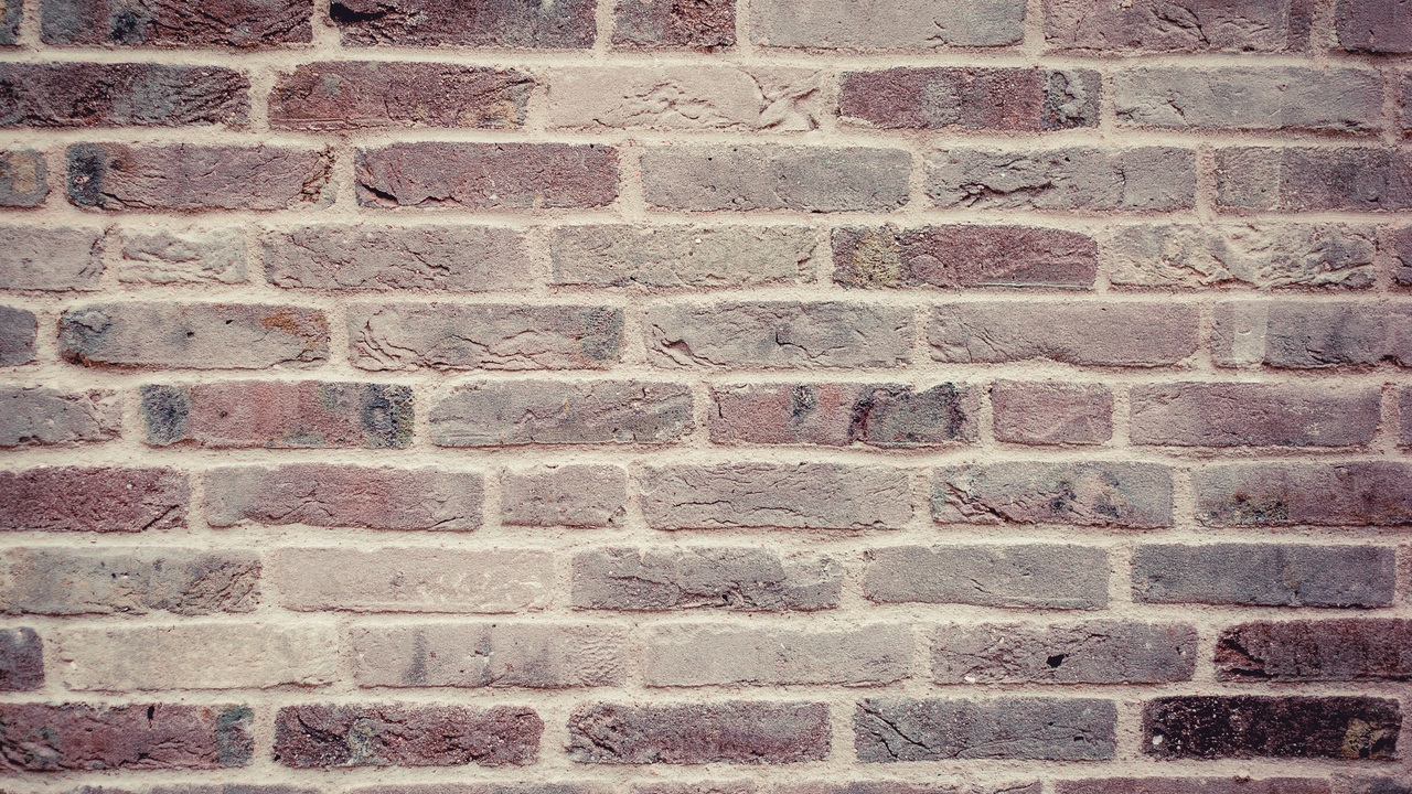
Fortunately, bootScore offers more exciting variants in an additional package. For example, the vertically aligned masonry form: The starting lines of the articles appear in four vertical columns side by side, opened by the respective Featured Images. And in each column, the next article succeeds directly after the predecessor. So the ‘reading bites’ overlap, like the bricks of a wall, but vertically:
Solution
- Install the plugin bs Masonry via ‘Plugins/Add News’ in the WordPress backend.
- Download the package bS Loop Templates and unzip it.
- Copy the file
archive-masonry.phpunder the namehome.phpinto your child theme. - In that file, replace
the_excerpt()withthe_content()and - remove the following
divincluding the embedded line<a class="read-more...
Background
bootScore itself describes the pure masonry installation and activation. I myself don’t want to completely switch to that style, but just my general overview page. So I copy only the file archive-masonry.php into my child theme — under the name home.php
But we can do more. The WordPress function the_excerpt() — as it is used in the home.php — displays the post content up to a certain length purely textually. No links, no text design. Often, however, the reader likes to read the inviting first lines of an article, visually designed. To get such an ‘intro’, the author manually must set the <!-- more--> tag in all articles, replace the_excerpt() by the_content() in the template, and remove the succeeding div section containing the read-more-link.
This allows the author to decide how much text to use as a teaser. She cuts off where it makes sense. This is how text beginnings of different lengths are created. And that of the vertical ‘brickwork’ turns out more clearly.
And how does this …
… support our migration to bootScore? Well, when the web designer has completed her work on good illustrations, she can relax and integrate tags and clouds into her site, improve her overview page and design her own landing page. Whether the resulting fullness really benefits her own reader, whether it can become slimmer and how, whether more discreet references and specific fonts also increase the readability, all this she should nevertheless consider while implementing these features. This post supports these steps towards a personalized bootScore site.