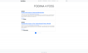
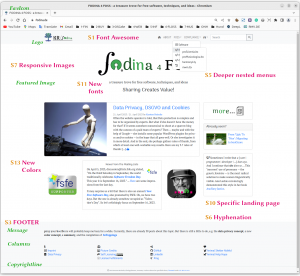
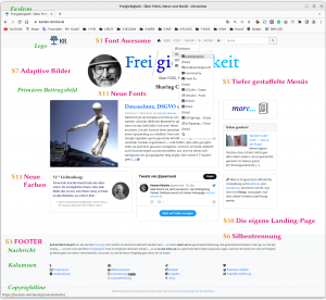
Linking Bootstrap and WordPress to get a responsive design is the task of bootScore, a WP-theme bringing along what the web designer actually does not want to program herself. Instead, she can now rely on an MIT-licensed preliminary work hosted on GitHub. But its ‘standard outfit’ still must be personalized, ‘pimped’ — by the work of a Web Designer? The theme is adapted — so bootScore — by modifying its “[…] .scss, .php, and .js files”. So you can pimp your bootScore easily. Here are my 13 steps from a pure bootScore to my personal ‘homepage’:
As a starting point, I had (already)
Eventually, this results in a way
- Font Awesome — one symbol says more than 100 words: ShortCodes and CSS classes
- SEO from the beginning: HTML semantics, keywords, and sitemaps, and no dead links, please.
- The ‘(un)important’ at the bottom: The discreet and comprehensive footer area for the ‘subordinated’ legal stuff, the subordinated secondary menu, and the custom copyright line.
- Thinking multilingualism: bilingualism without WP globe
- For clarity: the deeper branched menu with integrated shortcodes, clean layers, and readable stacking, which nevertheless has to be no H‑OVER menu.
- Don’t fiddle, automate: The built-in hyphenation
- A picture says more than 1000 words, for example,
- an image with a fancy box manually inserted into the text — gladly accelerated delivered via WordPress pre-calculated image sizes or as SVG.
- an automatically managed ‘primary post image’, not (less) blurred when adjusted for Responsive Design’s sake: That organizes the modern IMG tag with the source information probably best. Faster to implement, but less effective, would be to have WordPress calculate another image size in advance.
- images, that are offered on the web as really free images if we provide an image directory to meet licensing requirements.
- And the little browser images next to the URL? Or the logo? For that, we use bootScoore’s logo and favicon system.
- Easing the finding: TAG clouds and post lists in the sidebar
- The walled overview: The Masonry Contribution List.
- First things first: a dedicated landing page — self-designed — and then get rid of what’s distracting, use context-sensitive sidebars and more discreet references to recent posts.
- Readability: bootScore and the custom general font and the font for special occasions
- Respecting the law is a need: data protection, a proper cookie dialog, and cookie management.
- The first impression counts: customizing the color concept.
By following these steps, a bootScore-based website in responsive design is created, that documents the way to it in itself. So that I can also lookup in the future, how I have done it in the past. If this also benefits others, that would be a welcome side effect.
- instructions on how to do this are aplenty, including one from WordPress itself. [↩]
- e.g. with those of the site to be migrated or the Theme Unit Test [↩]
- e.g. according to bootScore instructions [↩]


